- Blog Home
- Emily Chang
- Building The Ultimate E Commerce Landing Page (With Examples)
Building The Ultimate E-Commerce Landing Page (With Examples)

E-commerce plays an increasingly critical role in business success. In recent years, retail e-commerce sales have grown by more than 25% in the Asia-Pacific, Central and Eastern Europe, Latin America, North America, and Western Europe regions. Estimates predict that online retail sales will exceed $6.5 trillion by the end of 2023, accounting for about 22.3% of all sales.
While online shopping provides an enormous opportunity for businesses to reach customers and clients, it also creates a lot of competition. Online shoppers don’t need to think much about geographic limitations. They don’t need to travel to a store’s location, so they can compare offers from across the country or world.
How can you appeal to consumers when you have so many competitors clamoring for their attention? You’ll need a robust marketing strategy that carefully targets your audience and directs them toward e-commerce landing pages designed to convert shoppers into buyers.
Creating an effective e-commerce landing page
A significant portion of your online marketing strategy moves people toward your e-commerce landing page. Once they reach that destination, your page will influence whether they choose your business over competitors.
If you don’t already have a marketing strategy in place, consider hiring a content marketing consultant to guide you through the process.
Creating an effective e-commerce landing page should give you more opportunities to generate sales and revenue. Include the following to give your page everything it needs to convert consumers.
A Clear Call-to-Action (CTA)
Consumers need to know what your landing page offers. Writing a clear CTA eliminates confusion and encourages people to act.
Before you can write a clear CTA, you need to identify your landing page’s goal. Common goals include convincing people to:
-
Buy a product
-
Request a trial or demo
-
Watch a product overview
-
Sign up for your newsletter
-
Ask a rep to contact them
Your CTA messaging needs to reflect your goal as straightforwardly as possible. You don’t need to get fancy. Just tell your landing page visitors what to do.
Marketo offers good examples of strong CTAs. It has two CTAs on its Marketo Engage landing page. The top-of-the-fold CTA reads, “Watch product overview.” The below-the-fold CTA says, “Get a personalized demo.”
If this doesn’t seem like enough information, consider that most shoppers have already been exposed to your marketing assets before they reach the landing page. Your CTA doesn’t need to explain why they should act. It just needs to tell them how to act.
Informative, Persuasive Images
Your landing pages will have minimal text, so images matter more here than they do on your typical blog posts. This isn’t the place for copyright-free images found on Unsplash and Pexels. You want high-quality images that speak directly to your target audience about the quality of your product.
The type of image you choose will depend on your audience and product.
Meal kit subscription company Sunbasket uses professional photographs of prepared dishes to convert potential members. When someone’s comparing meal kit options online, mouth-watering photographs do a lot of heavy lifting on the landing page.
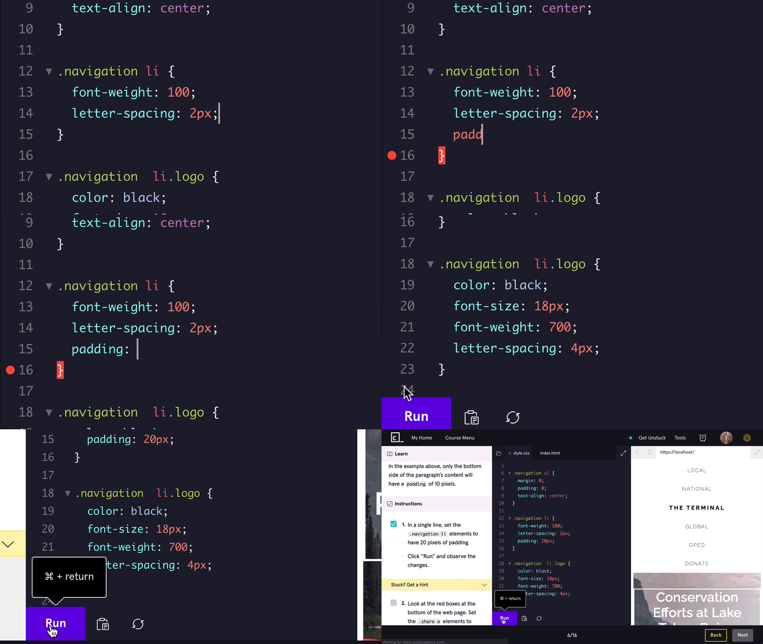
Codecademy takes a different approach that targets its audience. The Codecademy Business landing page shows a photograph of a young, confident coder at his workstation. It also features a GIF that shows a short clip of someone using the Codecademy service to learn a programming language.
Decide what types of images will appeal to your target audience and hire a professional to create them.
Brief, Compelling Copy
Write short, compelling copy that you can place at the top of your e-commerce landing page. Ideally, you can convert browsers without forcing them to scroll down the page. Your above-the-fold copy – online, above-the-fold simply refers to content at the top of the screen and doesn’t require scrolling to view – should communicate information directly without any fluff.
Mailchimp does a terrific job at giving potential users brief, compelling copy that leads to conversions. The company’s CRM landing page includes a few essential keywords (e.g., “marketing CRM software” and “customer relationship management”) in two short sentences. The copy takes up less than a quarter of the page (on a laptop or desktop, at least. The copy dominates mobile screens, pushing images out of immediate view).
When potential clients see the Mailchimp landing page, they get the final nudge needed to explore their plan options and convert into members.
A Lead Form
Include lead forms on e-commerce landing pages that you want to collect information about potential clients. You probably won’t include lead forms on landing pages for specific products. Instead, you would focus on pushing the reader to finalize a purchase. When attracting long-term clients, though, it makes sense to collect contact information so you can start building a relationship with them.
From a content marketing perspective, web forms and lead forms work well because they:
-
Help prevent spam emails
-
Integrate with most website-building platforms and CRMs
-
Improve the user’s experience
-
Generate quality leads from people seriously interested in what you offer
Like your CTA, you don’t need to get fancy with lead forms. Look at Scripted’s.
It has a clear message at the top that prompts people to start a free trial and asks interested parties to create accounts by entering their:
-
Name
-
Business email address
-
New account password
It’s all very basic information that anyone can enter without much thought.
Click Triggers
A click trigger is the button you find on most e-commerce landing pages. They usually include a short CTA like “Start your trial” or “Sign up.”
You need a click trigger because it stands out from other elements on your page. It grabs the visitor's attention and gives them a single button to move forward with their decision.
Paramount+ has good click triggers that correspond to its specific services and offers. Some examples from the streaming services page include:
-
WATCH FREE EPISODES
-
GET THE BUNDLE
-
REDEEM NOW
It’s common to write click trigger CTAs in all-caps.
Depending on your landing page’s design, you might have one or more click triggers. If you have a short page, you probably only need one. Longer e-commerce landing pages can include unique click triggers made to match each section’s content.
Plenty of White Space
White space refers to the empty areas that surround your e-commerce landing page’s key assets. Don’t let the word “white” confuse you. You can use any color to create empty space on your page.
White space helps people concentrate on the messages and images you developed to convert traffic into buyers. It might not sound exciting, but it’s critical because it reduces the “noise” and clutter that could distract visitors.
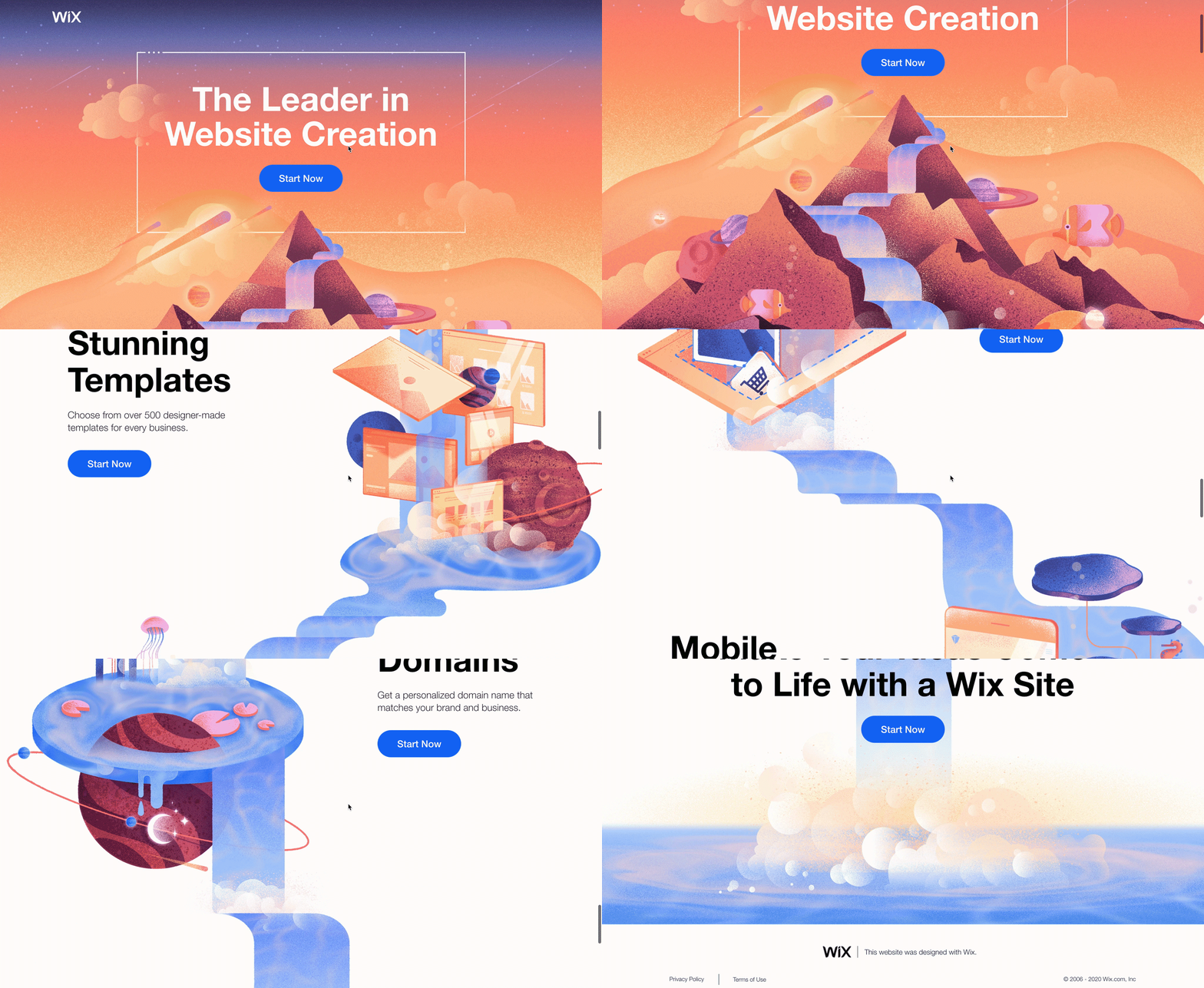
Wix has an excellent landing page that plays with white space, illustrations, and text. The white space provides a canvas that lets colorful images traverse across the screen. As you scroll down, the illustrations move left to right, creating room for information text, CTAs, and trigger buttons. It works because the designers set everything against a blank background.
Responsive Design
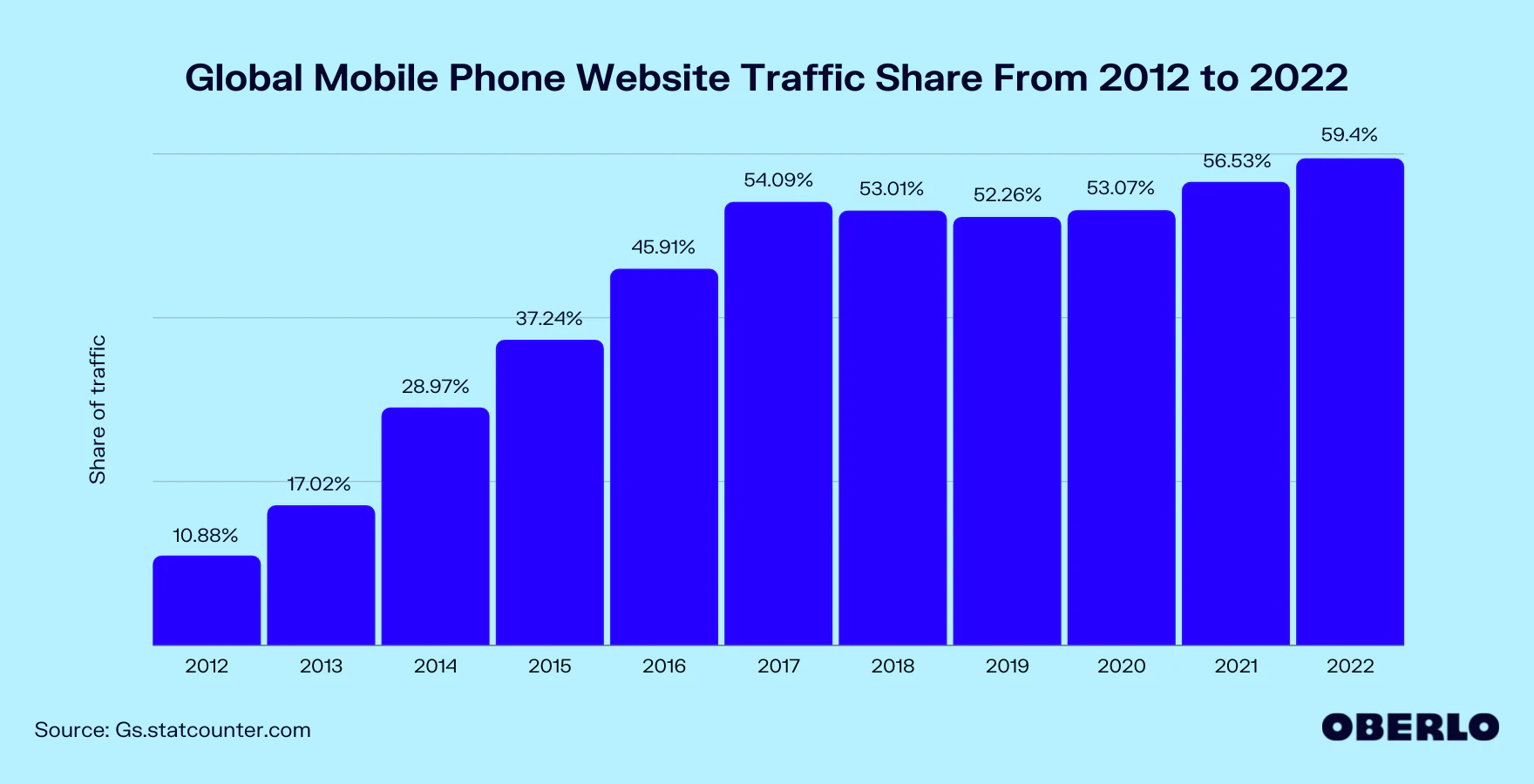
Worldwide, mobile devices account for more than half of internet traffic. Expect that percentage to grow as more young people decide they don’t want to spend money on laptop and desktop computers. They get everything they need from smartphones and similar mobile devices.
Responsive design lets your website adapt to the user’s device. The Mailchimp landing page serves as a good example again because it declutters pages for mobile visitors, emphasizing the CTAs and triggers the company wants people to interact with. Yes, professional images can influence how people respond to your e-commerce landing page. When you have to trim every unnecessary pixel, though, it makes sense to give people a bare-bones design without many images.
Since responsive design knows what type of device your visitor uses, it can optimize the experience to the individual. When appropriate, your e-commerce landing page will display images and videos that drive conversions. When those creative assets slow response times and add clutter to small screens, your page will push them away to focus on the essentials.
More Great Landing Pages for Inspiration
- Great Jones: Stunning photographs of products and a simple "Add to Cart" trigger button make landing pages on the Great Jones website effective.
- Door Dash: Door Dash gets to the point with a web form that requests your address and returns participating restaurants in your area.
- Wag!: A prominent lead forum, QR code, and adorable photographs of walkers with dogs make the Wag! landing page fun and enticing.
- Talkspace: The Talkspace landing page converts with an encouraging statement, brief explanation of benefits, and photograph showing someone using the service.
- Bills.com: Bills.com gives you an interactive slide and asks you to choose your amount of debt before continuing a line of simple questions that leads you to an effective debt relief strategy. You're participating before you even sign up!
Get Landing Page Copy That Converts Visitors
E-commerce landing pages need carefully crafted messages that engage visitors and convert them into paying customers. Scripted’s talent pool includes landing page writers with experience in diverse industries. Also, you can choose a Scripted membership that includes performance and optimization services. A dedicated account manager can help you create and monitor a content marketing strategy designed for your unique needs. Performance monitoring can look at factors like:
-
Bounce rates
-
Keyword rankings
-
Conversion rates
-
Page speeds
-
Organic traffic
When these key performance indicators don’t match your expectations, your account manager can pivot to try a different approach. You always get the attention you deserve because Scripted succeeds when your landing performance outperform the ones your competitors use. See how Scripted makes it easier for you to publish e-commerce landing pages that get results.


