- Blog Home
- Seo
- Jd Peterson
- Understanding Website Consumer Behavior: Part One
Understanding Website Consumer Behavior: Part One

Note: This blog post is going to address Google Analytics (GA) primarily, so if you're not familiar with the GA interface I would suggest looking around your dashboard to get familiar with the different tools.
Many sales departments and biz dev teams focus on generating more prospects, more leads, and driving qualified business to their website. While increasing the number of inbound qualified leads to your company's website is essential for growth, understanding how potential customers are interacting with your website is equally as important.
- What are your top 3 pages visited? After visitors land on your homepage (most common entrance), where are they going?
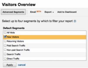
I like to look at new visitors hitting the site as they aren't familiar with the structure yet. You can filter for visitor traffic source in the top left of GA:
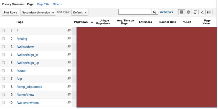
To look at how your users are interacting with your web pages you can go to Content>Site Content>All Pages tab or the Audience>Custom>Visitor Flow chart:
I've blurred the numbers to keep our website data private, but the story is still accurate. After new users hit our homepage, the next page they visit is our "Pricing" page. The next most popular page is the "About" page (skipping our writers logging in to view jobs). It should be no surprise; people want to know what we do, who we are, and how much our services cost.
2. What pages lead to conversions?
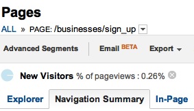
Given that people have looked at our pricing page, would this lead them to sign up for our services? A way to test this is to use the Navigation Summary tab in the same view:
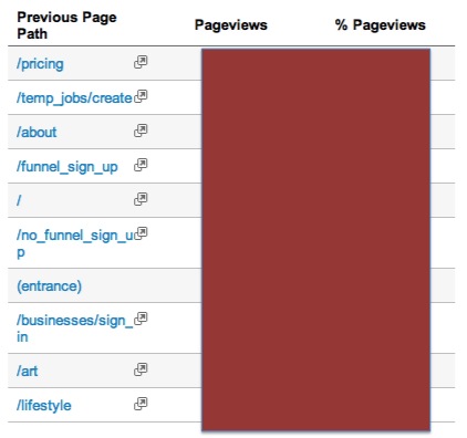
You can see which pages led to the business sign up page below:
This confirms my hypothesis that new users are more likely to sign up after they have seen our "Pricing" page and "About" page. In fact, the most common page that leads users to our sign up page is the "Pricing" page, followed by our "New Job Form" page, and the "About" page.
It's rare for a new user to sign up for your service or product directly from the home page with minimal research. By allowing users to easily navigate important aspects of your site and providing useful information for them throughout deeper level pages, your potential customers will be more informed about your service without getting frustrated and existing your site.
3. Is it easy for potential customers to sign up?
The final step is to make sure that there are easy calls to action for users to sign up no matter which page they're on. Below are the call to action buttons on the "Pricing" page as well as the "About" page, making it easy for potential clients to sign up after they've looked through the Scripted site. The current copy used is "Get Started" and "Become a Buyer."
In summary:
- Understand how people are using your site (top 3 - 5 pages)
- What information are new users looking for? Is it available and easy to get to?
- What pages lead potential customers to sign up for your service?
- Have a clear call to action across every page.


