- Blog Home
- Scripted Writers
- 10 Awesome Email Newsletters (And How To Mimic Them)
10 Awesome Email Newsletters (and How to Mimic Them)
The ROI for email marketing can be as high as 4400%, and it's numbers like those that continuously inspire brands to do better with their email campaigns. After all, an email address is a direct ticket to your key customers and prospects. Plus, with the average person checking their email 15 times a day, you're sure to see results.
The tricky part isn't being convinced that email newsletters are effective. Rather, the continuous challenge is finding ways to improve your efforts so that you get more opens and clicks and fewer unsubscribe requests. These exceptional email newsletters may help inspire you with their savvy tricks and engaging content.
#1 Away
The Away Newsletter
The luggage and travel industry as a whole has remained relatively unchanged over the past couple of decades. Away is a startup looking to change that. Technology has been rapidly inserting itself into just about every industry, but Away has come up with some unique — and very useful — concepts for "smart luggage" that makes traveling just a bit easier.
In Away's newsletter, they do a fantastic job informing readers about exactly what makes their luggage so special. However, it's more than a product plug. Away's newsletters also spotlight the latest brand partnerships that help reinforce their mission statement of "create a better world for everyone."
The "Color Stories" newsletter, in particular, showcases how the brand resonates with the wanderlust of their globetrotting, frequent traveler audience. With beautiful product imagery showcasing the luggage in use around the world while linking to luggage options in the same color tones, Away makes a strong connection and piques interest in their latest color options.
#2 Litmus
The Litmus Newsletter
Litmus, a brand specializing in email marketing, undoubtedly has the game down-pat. People who sign up for the Litmus newsletter are seeking engaging, informative content that will help you market (particularly through email) that much more effectively, and Litmus delivers.
In this campaign, you can see how the brand uses at-a-glance visuals that catch the eye and immediately inform the reader. By grabbing the reader's attention right away, they continue scrolling to see a collection of blog posts that may interest them if the header's double-CTA comparing single opt-in to double opt-in doesn't get them to click immediately.
#3 The Nature Conservancy
The Great Places Newsletter
The "Great Places" monthly newsletter from The Nature Conservancy easily has one of the cleanest and most eye-catching layouts of any nonprofit newsletter out there.
Consistent branding is key here as they continuously work to build and maintain trust amongst their audience of donors and supporters. In fact, you can always find a link in the upper right-hand corner with more information about the organization's mission and transparent statements.
The newsletter goes on to feature the latest news and educational content, providing plenty of options for readers to stay connected with the organization's work.
#4 charity: water
The charity: water Newsletter
While on the topic of nonprofits, charity: water does an incredible job of keeping donors involved well beyond their initial gift. Follow-up is an area where most nonprofits struggle, but with beautiful timelines and impactful imagery, this charity is able to instantly show donors how their donation is changing lives.
After telling the donor what their money has helped accomplish so far, they then give more detailed information about the project. They share statistics about the geographical location being helped and include photographs of the progress. The attention-to-detail makes for a newsletter you'll want to continue opening every time it arrives in your inbox.
#5 Postmates
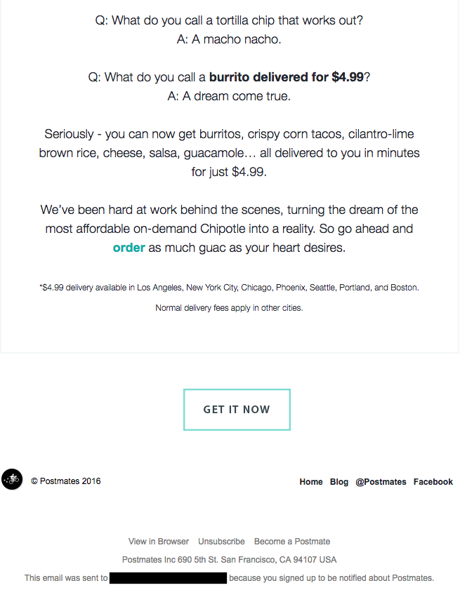
[IMAGE: https://blog.hubspot.com/hs-fs/hubfs/chipotle-gif.gif?width=600&name=chipotle-gif.gif]
You might not think that the popular food delivery app, Postmates, has a lot to say to its users. However, the brand actually puts a lot of effort into staying at the top of people's minds, which has become increasingly important as new competitors have continued popping up over the past couple of years.
For Postmates, their email newsletters offer an opportunity to connect in a way that builds the brand's reputation and reminds readers when their mouths are watering. This particular email uses a tasty gif at the top to catch attention, followed by the long-awaited announcement of Chipotle being added to the app.
#6 InVision
The weekly newsletter from InVision has it all, starting with on-point branding. They start off the email with something seen in other examples on this list: a strong CTA! Right at the top, there's an offer for a free course and the button to claim it. If that doesn't snag the reader's attention, scrolling down, you'll see other posts and news that may interest InVision's followers.
You should also take note that InVision is careful to avoid basic "Read More" buttons and works to include really engaging button text instead. This alone can really improve click-through rates and add more personality to your newsletters, so consider trying it next time around.
#7 JotForm

A popular alternative to TypeForm, JotForm's newsletter uses colorful custom imagery to bring the brand's concepts to life. This particular newsletter is being used to announce the latest integrations, which is par for the course for the brand. JotForm consistently focuses their newsletter on keeping users engaged by sharing exciting news and announcements that will ultimately boost productivity.
The subject line is straight-to-the-point, too, mentioning Monday.com and some other big names that the tool now integrates with, encouraging opens so subscribers can read the complete list. JotForm also does something else really impactful by including a video newsletter with every campaign. It complements the written content and can also be digested on its own for those who don't have time to read through it all.
#8 Torani
Torani has a unique user base consisting of both individuals who love their flavored syrups at home and businesses who use them behind the counters of bars and coffee shops alike. That means their newsletters have to resonate with a wide audience, and somehow they consistently pull it off by staying focused on their offerings and providing inspiration on how to use them.
This themed edition of the brand's newsletter focused on the upcoming holidays and gave readers ideas on how they could come up with "mocktails" for the fall and winter months to come. In line with Thanksgiving, they also included a few sentences on what they're thankful for. This type of relatability, paired with tasty imagery, is what helps build loyalty with a brand.
#9 Paragon Sports
The end of the year is the biggest shopping season of them all. Black Friday discounts paired with holiday gifting inspires just about everyone to look around at the latest gear, and Paragon Sports tailored their November newsletter to capitalize on this well-known fact.
With a focus on new arrivals from Patagonia, ending with a focus on the latest sale, Paragon effectively earned click-throughs with multiple buttons that easily direct subscribers to the exact category they want to shop in. This type of thoughtful structure is particularly important in eCommerce emails like this, but it's something that can also carry over into other content -- like if your newsletter includes links to different categories on your blog.
#10 Boll & Branch

The luxurious bedding brand, Boll & Branch, sends out short emails that are practically the epitome of minimalistic marketing. This example focuses on the need for thoughtful gifts at the end of the year, with the header emphasizing their beautiful gift boxes (which come standard on every order). Below, they go on to showcase a few products, showing off the color options, too.
At the end, they include a small graphic to remind subscribers of their commitment to being a clean company, with no chemicals. They go on to remind the reader of their ethical practices. They end the email with a reminder that you can always send a gift card if you don't know what to give, proving that product marketing doesn't always require a lot of copy.
How to Write A Better Email Newsletter
Exceptional, engaging writing takes time to conceptualize and create. Of course, when it comes to email newsletters, things can be even tougher. Not only are you responsible for creating a newsletter that people want to read, but you also have to write a subject line that makes people want to open it right away.
All the email newsletters on this list have one thing in common: They have great writers behind them. A newsletter writer needs to have an understanding of the audience and topics at hand, along with the ability to effectively communicate the goal of the writing, all while keeping them engaged and convincing them to click-through to the website.
If you're searching for your perfect newsletter writer, Scripted can help. With our team of over 6,000 pre-vetted, professional writers, we'll help match you with a talented individual. The results? More opens, more clicks, and more subscribers over time. Reach out to our team to learn more.
Published by Scripted Writers on Tuesday, March 9, 2021 in Away, Boll & Branch, Chairty: Water, In Vision, Jot Form, Litmus, Paragon Sports, Postmates, The Nature Conservancy, Torani.
