- Blog Home
- Content Marketing
- Scripted Writers
- What Are The Elements Of A Good Website?
What Are the Elements of a Good Website?
What are the elements of a good website? The quality of a website can make or break an enterprise in any industry today. Both aesthetics and function contribute to how your visitors experience and judge your website. Navigation should be clean and intuitive, and every section of your homepage should include clear, branded copy.
Websites take time and consideration, and most require several iterations before getting to that sweet spot. While the structure and function of a website depend on the unique brand and industry, the following elements are integral to the creation of any great website.
Lightbox Popup
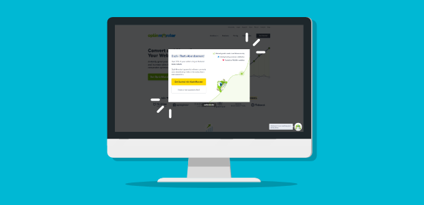
Lightboxes provide a pivotal invitation to visitors that want to continue their relationship with your brand. A lightbox is that centered pop-up you see on many sites today. Many brands choose to deploy a lightbox just as a visitor is leaving their website. It marks the last time they may ever interact with that potential customer. On the other hand, retailers often deploy a lightbox seconds after a visitor arrives. This gives them the opportunity to offer a first-time buyer discount or free shipping for purchases over a certain dollar amount. Including the same offer with a sign up form on each webpage gives visitors the chance to change their mind if they close the lightbox without signing up.
Fast Loading Speed
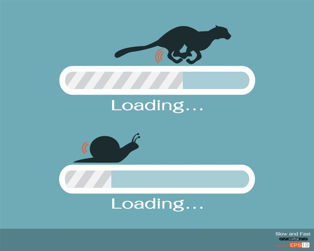
If your site doesn't load immediately, visitors are likely to think there is a problem and leave. Very few will wait around, especially if they are first-time visitors. A Kissmetrics report showed 47% of visitors expect a page to load in under 2 seconds, while 40% leave if loading time takes longer than 3 seconds.
You can test your website's load speed if you're concerned about its loading speed. Type in your URL and the tester will provide several important metrics, including your First Contentful Paint (FCP), which measures "the time from when the page starts loading to when any part of the page's content is rendered on the screen."
Customer Reviews
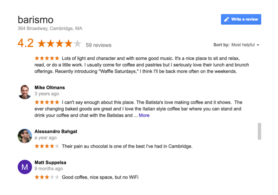
Some websites have testimonial pages, which can be great in professions where customer results hold the most weight (e.g. home remodelers, plumbers, etc). But all brands, regardless of the industry, should aim to have a few customer reviews on their homepage. To save space, many popular templates have an auto scroller that shifts between customer quotes every few seconds. Favor specific customer quotes over general ones to give your visitors clear insight into why they should work with you.
Targeted Copywriting

It goes without saying that copy is the most important element of a good website. Without speaking your customer's language and demonstrating you understand their problem, they won't take action. Targeted copywriting requires industry-specific knowledge and an ability to edit paragraphs down to the most potent messaging possible. Perhaps this is why, for instance, 84% of B2B companies outsource their writing tasks.
For busy professionals who need a steady stream of content from reliable professionals, Scripted's experienced writers deliver. Our vetted writers create industry-specific content tailored to the unique specifications of each brand.
Call to Action

One of the biggest mistakes business professionals make is not including a prominent call to action (CTA) often enough. Many brands may have a compelling CTA on their homepage but fail to follow through on social media and in email newsletters. Many experts recommended choosing one solid CTA for each major page of your website. Typically, these are the pages listed in your navigation menu. Inserting a CTA in blog posts is another way to drive readers to take action on your website.
On-Brand Design

Every brand needs a clean and attractive design to appeal to the average internet user. If your site doesn't measure up, shoppers have no problem finding a competitor website that does. Your brand colors and logo speak to your brand's core qualities, while your photos show visitors what they'll get when they become a customer (whether it's a concrete result or a positive emotional experience).
Each visual component of your site has a purpose and a job to fill. Make sure all your visual elements are doing their job. If there's something on your homepage that you can't name a purpose for, it probably doesn't need to be there.
Intuitive Navigation

Intuitive navigation empowers and inspires your visitors to keep exploring your site. The opposite (a confusing navigation menu) makes visitors feel blocked and like they can't find what they're looking for. Great navigation is often referred to as 'intuitive' because everything is right where the visitor assumes it might be. This includes a clearly visible menu and drop-down pages that make logical sense. Visitors should never struggle to find basic elements of a good website, like your About page, storefront, or Contact page.
Contact Information
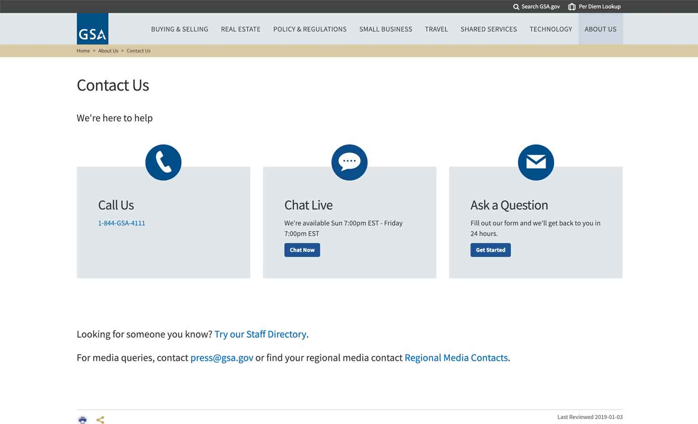
While it may sound obvious, many brands don't position their contact information prominently. Surprisingly, some don't display it at all. Brick and mortar businesses and restaurants need to provide an address, phone number, and ideally directions to their store location clearly on their website. For professionals who don't want to give out contact information, a simple contact form at the bottom of your homepage is a must-have.
SEO Optimization
SEO optimization isn't as simple as it was at the dawn of search engines. Today, Google updates its algorithm frequently, giving website owners a complex list of new rules. On top of that, there are far more webpages on the internet today - 56.5 billion to be exact. This means more competition for each keyword. However, this doesn't mean you should give up on your SEO strategy. Using longtail keywords, semantically related keywords, and other techniques can still pay off, boosting your website's rank. Hiring a professional SEO writer is one way to get the most out of your website content without a ton of SEO knowledge.
How to Spruce up Your Website
With this deep dive into the elements of a good website, you're ready to take your site to the next level. Integrating each of the above elements sets your brand up for engaged visitors and increased sales. Start by identifying the one element your brand could benefit from the most. Maybe load speed? Next, consider what element would be the quickest and easiest to implement. Lightboxes are relatively simple to implement.
It's important to perform a periodic website walkthrough as if you were a new visitor - What is the first problem that pops out to you? Does anything on your homepage feel like an eyesore? These are likely things your visitors notice, too.
Small businesses that can't afford to hire a web designer can ask a few trusted customers or partners to visit their website and share honest feedback. Pay special attention when the same bit of feedback comes from multiple customers.
Your website is the heart of your business, so make it an expression of your brand's deeply held values and raison d’être. The right audience will appreciate the time and effort you spent making your website a work of art.
Ready to put your content strategy on autopilot? Learn more about Scripted's Cruise Control, a complete content marketing strategy with account and analytics management. Scripted is the equivalent of an expert content team at a fraction of the cost. Reach out and schedule a consultation with one of Scripted's Cruise Control account managers today.
