- Blog Home
- Content Marketing
- Nicole Karlis
- Content Marketing For Beginners: What To Know About Ctas In Blog Posts
Content Marketing For Beginners: What to Know About CTAs in Blog Posts

Are you keeping your readers engaged after they consume your content?
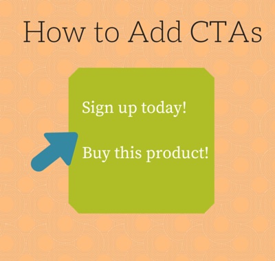
Call to actions, or CTAs, are what turn blog posts into workable marketing content. They give readers a reason to take the next step. They might invite someone to sign up for a newsletter, shop for related products or contact a company. No matter what result you want, the CTA is what helps the conversion happen. If you aren't including a CTA you might be missing out on a lot of opportunities -- here's what you need to know to get started.
See also: Need Inspiration For Your Written Content? Check Out These 5 Blogs
Elements of a Well-Written CTA
A good CTA gets straight to the point while keeping the reader interested and engaged. When leading from a blog post about a specific product, the CTA should be something simple that leads directly to the product page. A "Shop Now" button might work well for an ecommerce or fashion company.
For an introductory post, CTAs should lead to more information, but the type of information needs to be clear. For example, a restaurant blog describing the basic cuisine on the menu might lead to a specific dish recipe. The call-to-action might read "Click here to try one of our mouthwatering recipes at your house," or, more simply, "Try one of our mouthwatering recipes at your house."
Let's look at a few real-life examples.
HubSpot also does a great job keeping readers engaged and asking them to sign up for their newsletter.
Uberflip does a great job promoting their product by using their own:
Madewell has two call to actions on their blog asking readers to sign up for the newsletter and shop their clothes:
Solving the Placement Problem
Blog writers typically include CTAs at the end of their posts. This gives readers a place to look when they want to see the next step. A reader might only need to see the first couple of paragraphs to make a decision. Then, they scroll down to the general CTA. This is a good industry practice. By giving readers what they expect, you help remove click fear and uncertainty. No one jumps ship because they can't find the button. Another popular area to put a CTA is on right side of an article page.
REI's blog asks reader to rate each post on the upper righthand corner using a rating scale of five pine trees:
See also: How to Build The Right Content Team For Your Company
Shopify asks readers to sign up for their newsletter at the end of a blog post:
Making CTAs Pop
Visual elements also play a big role in CTA success. A link that doesn't look like a link won't get as many clicks. Links, buttons and overlays should stand out from the surrounding text. That is the whole point of embedding them. They draw the eye and convey the message, all in just a few words. You already use buttons throughout your website, so don't forget about them on your blog. Links are good for citing sources, but buttons can drive more traffic.
Buttons give you license to be different. They almost demand originality. When viewers look at three buttons, they are programmed to choose the one that looks different. Since it is more interesting, it will draw more clicks. For a button, interesting starts with size, shape and color. If using a button inside text, be sure to make it just a little bigger than the neighboring text, and give it a contrast color. This will help it pop. Let's take a look at a couple fun examples.
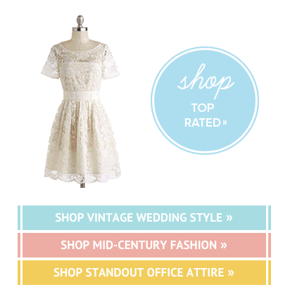
Modcloth has an animated CTA on their blog that encourages readers to shop:
Marketo has an overlay when you visit the blog to promote their annual conference:
Overlays are a great way to grab a reader's attention and gain conversions. In video content, an overlay is a semi-transparent, clickable ad. In text content, an overlay is substantially the same. When the mouse hovers over the overlaid text, a small box appears with links and additional information specific to the anchor text.
Be Direct and Direct Results
Keep your call to actions simple, visually obvious and direct. Test different styles to see what drives the best results, and don't be afraid to try something a little outside the box. No two blogs are the same, and you can cook up a recipe for success as long as you keep things simple and clear.
What CTAs do you have for your blog content? Share your thoughts with us in the comments section below.
Read More About Content Marketing:
Content Promotion Strategies: 4 Roads to Success
What Social Media Visits Bring to Your Content Marketing Strategy
Promoting Content on Social Media: How to Increase Your Shares [Interview]


